Posts

Showing posts from March, 2023

De Geadache

Image
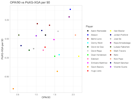
 Sweeping and keeping  In this entry, in consideration of David De Gea's impending contract renewal discussions, I looked at goalkeeper performance in the premier league. Data is provided by FBRef. Ideally the graph quality would be better but blogger's image compression has defeated me on this occasion.  This graph shows a selection of data points for premier league goalkeepers. On the y-axis is PsXG-XGA per 90, in essence this is a metric that measures a goalkeeper's shot stopping ability. On the x-axis is OPA/90, namely, the number of times a goalkeeper makes a defensive action i.e. clearing the ball outside their penalty area per 90 minutes. This can be a useful measure of the proactivity of a goalkeeper in protecting the space behind his defenders.  This data set was filtered to remove any goalkeeper with less than ten 90s in the premier league this season.  David de Gea will naturally already be well-known to practically all football fans and recently acqu...

Linear Progression

Image
 League and Financial position To cap off a recent series of financial posts on this blog, I had a crack at learning to apply linear regression in R. I wanted to see the relationship between United's league position and overall revenues for the last few years. Let's dig into it further.  Linear regression charts the relationship between two variables, in this case, League position and revenue. A straight line is then drawn through the data points to predict the value of the response variable (revenue) to the predictor variable (league position).  Whilst the model would appear to suggest an association between the two variables, in fact, it fails to account for the fact that lower league positions are in fact not more valuable, despite the nominally higher value of the integer 6 itself over 2 or 3. In fact, when viewed correctly, there appears to be little to no relationship between league position and overall revenues.  When the vicissitudes of football club finances...

Fore Fore Two

Image
 Forecasts  After my previous post analysing United's historical financial performance, I decided to flip it on its head and produce a forecast instead.  The created table shows United's revenue for each quarter in addition to the forecasted revenue (the line) alongside the lower and upper prediction intervals.  This forecast uses an ARIMA model (Autoregressive Integrated Moving Average) to forecast future values by considering the data, trends and seasonality.  In essence, this depicts, United's forecasted revenue (the blue line), the upper and lower prediction intervals to a 95% level of confidence (the blue shaded area) and then the same to a 95% level.   Interpreting the results, it appears that the revenue forecast anticipates that revenues will largely remain flat.  This is unsurprising when the historical data, as seen in the last post, is highly indicative of this, with revenues having little fluctuation overall since 2015. Unfortunately, ...

Some sports adjacent financial analysis

Image
 Some sports adjacent financial analysis To follow on from my previous post, I thought I'd turn my attention from United's on-pitch performance to their financial situation.  Whilst this is obviously only tangentially football related, the business of football itself is sadly more relevant than ever to both sporting success and institutional achievement. This was also a useful exercise in learning to carry out some basic financial analysis functions in R including time series analysis, financial analysis and forecasting.  To begin with, I performed a time-series analysis of United's quarterly revenues from 2015 to 2022. This can be seen below.  For anyone unfamiliar (including myself until recently!), time series analysis is a statistical technique used to identify patterns and trends in data over time.  This can include analysis of both trends (long term movements) and seasonality (year-in-year movements). To break this down further the above charts show the fo...

An experiment in rolling averages.

Image
 An experiment in rolling averages.  For my inaugural post on this blog, I've decided to begin with the team closest to my heart: Manchester United and their, fortunately, fairly successful 2022-23 season. I have examined this using a 5-game rolling average charting xG (expected goals) and xGA (expected goals against) to examine United's overall form across the season.  This served as an opportunity to learn to scrape specific data from the web, in addition to calculating and plotting the rolling average graphically. The overall data set used is located here: https://fbref.com/en/share/x4Ct3 . Unfortunately, this is partially incomplete so some results are sadly missing and have warped the overall pattern somewhat. Nonetheless some general impressions can be drawn.  On an initial viewing, the general pattern is positive, aside from an initial struggles at the start of the season, United have generally maintained a healthy, albeit not quite elite gap, between xG and x...